

Are You Bloating Your Mobile Web Pages With Too Many Elements? Then Stop.
Addicted to hours of online sleuthing, Jaydon was pretty sure that he needs to buy a single seater chair that would enhance the look of his living room. He quickly moved to browse a famous ecommerce site that sells furniture. Jaydon’s finger hovered over the phone screen for almost 3 seconds. The page was still loading….Jaydon had other things to attend. But, as the page took time to load, Jaydon hesitated to wait. He was clear what he wanted, had money in the bank to make the payment, and above all there was a need. In short, Jaydon was a perfect lead for any ecommerce site. Maybe he would not take one more look at this site again as the speed of the site was slow…
The brand lost a customer.
Hello, brands! Your Visitors have no time to wait for your page to load.
One of the prime factors having a huge influence on the customer retention is page load time – whether it is mobile page loading time or web page loading time.
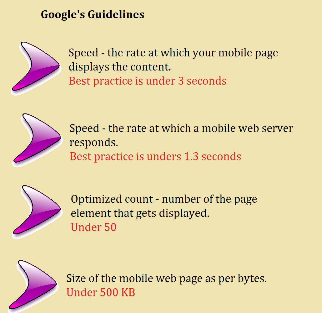
Google describes the best practice speed for a mobile page as under 3 seconds. So, it all pins down to this point. You need to deliver an exceptional experience to all your potential customers at a speed of less than 3 seconds.
Mobile pages need to be designed keeping speed as one of the prime criteria as this has the capacity to drive big results. Let your mobile page loading time not stand between you and the sale. Recalibrate your content, images and all related advertising according to the specified speed limits. Your site can start telling a story only when it loads at the right time.
Considering that most traffic now is on 4G, most of the mobile sites are still indicated to be slow and bloated with elements that take time to load.
Page speed is directly related to bouncing rates.
While the notion of several deliberative ecommerce sites is appealing, it does explain in cases like Jayden that many visitors ignore such sites because of the page loading time.
It is that online shoppers these days actually commit very little time when making a purchase or doing a research. So, brands need to wake up to this need and make changes that can speed up their site and reduce bounce rates.
For this, you need to exercise power that you never asked for…
Carefully crafted user experience and thoughtfully designed UX pages are the quick winners. Faster the better. Keep your page elements less. This will drive better results. If you struggle creatively, then asking a Web Design Cardiff company (if that is where you are based) to come up with the latest and most efficient designs might be a good way to go.
Google’s guidelines for mobile page speed, page size, and the weight (ie) the number of content pieces per page is as follows;
Why do you need to bother about mobile page speed?
- Consumers rely the most on mobile researches and purchases. Shoppers prefer to buy through Ecommerce apps. Reasons quoted for this change as per a research and statistics company includes; flexibility in surfing, time-saving and easy to compare prices. If you are not catering to mobile users, you are ignoring the major percentage of potential conversions. So, it is essential to focus on those elements that will quickly load your page and make you visible. Deliver fast, frictionless experiences. You can win or lose a customer depending on the speed of your mobile site.
- Brands are fighting to have an effective mobile presence – Competition is high. Your visibility is essential. Your ranking on search engines is much more essential. Google too ranks a site based on the page speed. So, design your pages like your traffic depends on it. Focus more on those elements that matter to your customers.
- Consumers are goal-oriented – so provide all elements easily and quickly. If your landing page is more complex, it can affect the conversion rates. Images, page elements can affect the speed. Simple and small changes such as mobile web page layouts, the fonts, images, colors, form factors etc may be far more critical to optimizing your page for better results. Such changes will have a huge impact or rather influence your customers’ purchase decision.
Slowly loading pages, lack of mobile responsiveness, and unfriendly navigation are the three top reasons for a visitor to leave a site, according to a recently conducted survey.
Key principles to follow while designing your mobile web page
- Landing page
- Site navigation
- Frictionless
- Usability
- Elements
- Form factor
Have a look at the following image which indicates the most common mistakes that are found on many websites.
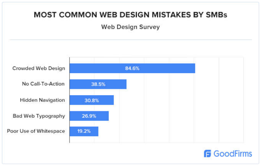
Image source: GoodFirms.
Crowded web design, no call-to-action, hidden navigation, bad web typography and poor use of whitespace are noted to be the major drawbacks.
These elements can have a huge impact on the customer experiences which eventually affects your conversion rates.
By not addressing this, you are not just losing your visitors but it also affects your feedback, word-of-mouth, reference etc. The result is severe sales loss due to few seconds of page loading time.
Neil Patel, digital marketing specialist and co-founder of Crazy Egg suggests in one of his blogs to “trim a few seconds off” by retaining the bare essentials efficiently.
Final Say
“Speed is a great asset; but it’s greater when it’s combined with quickness – and there’s a big difference”
Gathering online audience’ attention is critical these days. Start by being relevant and by being quick in delivering what customers want. By strategizing the appearance and functionality of your mobile page, you can really push the needle and align it well with your business goals.
Simply, try to reduce those page load time ad see how your sales are flaring up!
[ssba]