

Print Advertising Design Trends For 2019 & Beyond
Designers in all disciplines and industries need to stay abreast of popular styles and fashions in their world – whether that be in order to get on board with them or knowingly buck the trend. One of the worst things a designer can do is produce work that is outdated, irrelevant, or uninspiring – and advertising is no exception.
With 2019 still in its early stages, it will be a worthwhile exercise to look forward and make some predictions about the print advertising design trends of the near future. So what kinds of billboards, banners and retail graphics can we expect to see this year – and why?
Duotones
Duotone effects have been pretty popular throughout 2018, appearing in many high-profile digital places (such as in Spotify’s playlist graphics). These images can be considered to be at once modern and somehow evocative of a nostalgic sensibility.
The two-tone colour effect – which is relatively easy to create in Photoshop – creates a striking and memorable impact and is a great way to create imagery than can be easily overlaid with text without creating too much visual confusion from competing elements.
Duotone images have been popular throughout the previous year with web designers in particular, and we’re expecting to see more of them appear on billboards and in other physical printed media in the coming year.
Living Coral
Every year, Pantone release their colour of the year and this has a measurable impact on the industry. Described as ‘An animating and life-affirming coral hue with a golden undertone that energizes and enlivens with a softer edge’, Pantone’s colour for 2019 is ‘Living Coral’ – and we’re expecting to see it used quite a lot.
The shade has been chosen in direct contrast to our increasingly hectic and digital modern lives. This shade of coral encourages a sense of light-heartedness, and bridges the gap between our modern lives and the natural world (it appears as a tranquil hue in nature, yet it is effective on things such as social media platforms).
Hand illustration and lettering
2018 was a year of glossy photography, digital layouts and clean, sans-serif typography. 2019, then, may see some designers aiming to stand out from the crowd by taking a more down-to-earth and personable approach.
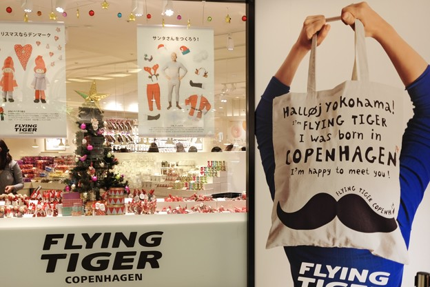
Image by ひでわく– Licensed under Creative Commons 2.5
Especially for brands that emphasise quirkiness or creativity – such as Danish retailer Flying Tiger (pictured above), which has employed hand-lettered text and the work of well-known illustrator David Shrigley to great effect – the use of hand-drawn promotional materials can be a powerful way to communicate personality, approachability and a sense of fun.
Narrow hand-lettered fonts such as Moon Flower seemed to be everywhere in 2017, and as such have fallen somewhat out of vogue in today’s design landscape. Instead of typefaces that mimic handwriting, designers in 2019 may instead opt for real, honest-to-goodness lettering painstakingly picked out by a professional illustrator – in order to get that truly authentic handmade vibe.
Put next to more generic advertising materials comprising slick product photos and digital typography, hand-drawn marketing graphics can seem compelling and fresh (and this year, we may see some advertising designers move away from the Adobe Creative Suite and put together the kinds of imagery that require fine liner pens and paper).
Genuine, personable photography
Print advertising has been long been plagued with contrived and impersonal portrait photography, and in recent years the trend has been moving steadily toward favouring imagery that presents a more natural and relatable outlook.
With more companies and brands seeking to appear authentic and trustworthy, the stiffly composed, carefully lit and immaculately edited promotional photos of years gone by are on the way out.
Instead, advertisers in 2019 will be seeking to use images that evoke a more spontaneous and genuine feel. Whether using “real people” for their photoshoots instead of professional models, minimising the post-processing gloss and colour-correction – or otherwise trying to capture pictures of genuine emotion – this year’s advertising designers will be keen to use photographs that communicate real character and integrity.
In some cases, we may even see non-professional or smartphone photography appearing on billboards and banners in 2019. Advertisers such as the European banking giant Santander have found recent success with campaigns incorporating material that is (or at least appears to be) amateur home photographs and videos sourced from the public, and the potential of this idea will likely continue to develop in the near future.
Chunky typography

Recent years have seen a proliferation in print advertising of classic sans-serif typefaces such as Futura, Gotham, Gill Sans, Trade Gothic and Franklin Gothic (which somehow manages to always look modern despite being nearly 120 years old).
This year, advertising designers may be moving away from those clean, slim lines and opting for something more weighty and classical. Heavy, serif typefaces such as Bookman (pictured above) can communicate gravitas and trustworthiness by implying traditional values and a long history of service – all while tapping into the ever-popular modern love of retro chic and nostalgic values.
Debate continues in the design world as to whether it is serif or sans-serif fonts that are the more readable, but especially at billboard sizes the two can be mixed and matched – and the common practice of using serif typography for larger text paired with a sans-serif font for body text and small print will likely be ongoing.
Given the abundance of sans-serif typography in last year’s advertising, we may well see many designers in 2019 adopting a different approach to stand out from the crowd and deliver something that is both impactful and stylish.
Colourful gradients
Image: Public domain
Designers have been making use of eye-popping gradient fills in 2018, and we don’t see them going away any time soon.
Once thought to be an embarrassing bygone obsession of the 90s, coloured gradients have made something of a comeback in recent times. Whether in use as a multicoloured filter for photography or as a key logo and branding component (à la Instagram and Apple Music), advertising designers have recently rediscovered the power of a well-deployed gradient – and we’re starting to see a shift away from the predominance of flat colour design seen throughout much of the 2000s.
Gradients can be used to communicate a wide variety of moods in an interest-grabbing way. From pairing vibrant opposing colours to create a striking ‘pop’ of colour to blending two or more subdued colours for a nostalgic or restrained appearance, gradients represent a broad selection of possibilities.
As gradients are a great way to add interest to advertising images whilst preserving their simplicity, we can probably expect to see them more this year – especially in the tech and entertainment sectors.
Overall, the world of print advertising looks set to see some strong, colourful, genuine and stylish work this year. We will likely see both continuations of themes established in 2018, and also unexpected developments that will react against the status quo and make bold new statements.
While it’s impossible to ever truly know what’s on the cards, an educated guess can prove invaluable for staying at the cutting edge of a fast-moving industry. By looking ahead to the future, a designer can use their knowledge of the advertising world and its trends to inform their own work – ultimately making something perfectly tailored to harmonise with or disrupt the on-going cultural zeitgeist.
….
This article was contributed by PressOn, one of the UK’s leading large format digital print companies – PressOn are renowned for offering innovative and cutting-edge print solutions, providing their clients with nothing but the very best in the industry. Their decades of expertise means they’re well attuned to developments in the design & marketing industries.
[ssba]